


 Wings
 Racing Tribal
 Flames
 Barbecue BBQ
 Body Building
 Dive Scuba sports
 Fishing Lures
 Martial Arts
 Martial Hieroglyph
 Paintball
 Sailing
 Surf
 Farm Birds
 Farm Mammals
 Mammals
 Birds
 Insects
 Reptiles
 Snakes
 Fishes Fresh Water
 Fishes Salt Water
 Dolphins
 Tuna
 Sharks
 Dragons
 Monsters
 Zombies
 Alien UFO
Design Notes
Fonts for Vehicle Lettering: Readable from 20 Metres

Nov
Quick answer: to read lettering on a van from 20 metres, the company name needs letters of roughly 15–17 cm for easy reading and never under about 6 cm. Choose a sans-serif with a large x-height and open shapes (the DIN, Frutiger or Transport family of designs), set it in bold rather than black, track it slightly open, use mixed case for names, and put strong contrast between letters and paint.
Test it before you cut: print the layout at 1:100 and read it from 20 cm. That is exactly what a 20-metre view looks like.
Vehicle lettering does one job: a stranger in another car, at a junction or across a car park, has to read your name and your trade in the second or two they glance at the van. A typeface that looks elegant on a laptop screen at arm’s length can turn into a grey smudge at 20 metres. This guide is about choosing and setting type that survives that distance, written from the cutting table rather than the font menu.
How big the letters must be at 20 metres
The sign industry works with a simple rule of thumb: about 1 inch of letter height for every 10 feet of viewing distance for comfortable, high-impact reading. In metric that is roughly 0.8 cm of letter height per metre. Readability tables from sign suppliers such as Signazon put the absolute limit (just readable with good eyes) at three to four times that distance.
Road-sign research gives a similar floor. The US traffic-sign manual (MUTCD) designs static signs for about 30 feet of distance per inch of letter height, and a Federal Highway Administration study found observers with normal vision managing around 40 feet per inch. Converted to metres, the numbers look like this:
| Viewing distance | Comfortable reading (cap height) | Bare minimum | Typical use on a vehicle |
|---|---|---|---|
| 3 m | 2.5 cm | 1 cm | Website, licence or registration text by the door |
| 5 m | 4 cm | 1.5 cm | Rear window: phone number read at traffic lights |
| 10 m | 8 cm | 3 cm | Tailgate and rear doors, list of services |
| 20 m | 16–17 cm | 6 cm | Company name on the side of a van |
| 30 m | 25 cm | 8–9 cm | Box truck or trailer side |
| 50 m | 40+ cm | 14 cm | Lorry curtains, read across a road |
Two points the tables usually leave out. First, these figures assume a sign facing you square on. Vehicle sides are usually seen at an angle, which squeezes the letters horizontally, so add a margin on top. Second, the “bare minimum” column is for a parked vehicle and a reader who is looking for you. A moving van needs to be in the comfortable column.
What makes a typeface readable at a distance
Distance acts like a blur filter. Thin strokes vanish first, then small gaps close up, then similar letters start to look the same. So the questions to ask about a font are practical ones:
- Large x-height. Lowercase letters with a tall body (the height of an x compared with an H) stay big when the cap height is fixed. This is the main reason a font such as Frutiger reads better at distance than Futura at the same point size: Futura’s lowercase is small and its round letters look alike.
- Open apertures. The gaps in c, e, a and s should be wide. In tightly closed designs the e fills in and turns into an o at 20 metres.
- Even, solid strokes. High-contrast designs (fashion serifs, Didone styles) have hairlines that disappear at range. Choose a typeface whose thick and thin strokes are close in weight.
- Distinct letter shapes. Check the capital I, lowercase l and number 1, and the 0 and O. In phone numbers a confusing 1 or 7 costs you calls.
- Normal width. Condensed fonts fit more text on a door, but their narrow counters close up. If the name is too long, reduce the words, not the width.
It is not a coincidence that many of the fonts designed for signage share these features. DIN was built for German road and rail signs, Transport was drawn by Jock Kinneir and Margaret Calvert for British road signs, and Frutiger started life as the signage typeface of Charles de Gaulle airport. You do not need those exact fonts, but they are a good benchmark: put your candidate next to one of them and see which one holds up when you squint.
Weight: bold, not black
The instinct is to make lettering as heavy as possible. Up to a point that works: regular weights look thin on a van, and bold or semibold is the usual sweet spot. Beyond that, black and ultra weights fill in their own counters. At 20 metres the a, e and s become solid blobs. Pick the weight in which the inner spaces are still clearly open when you look at the layout from across the room.
Mixed case for names, capitals for short words
Words set in upper and lowercase have a varied outline (ascenders, descenders, round and straight letters), and that outline helps readers recognise a word quickly. This is why British and German road signs set place names in mixed case. All caps are fine for one or two short words such as TAXI or 24H, but a longer name or a list of services is easier to read in mixed case at the same height.
Spacing: a little looser than on paper
Letters that almost touch on screen will visually merge at range. Open the tracking slightly (around 3–5% of the font size is a good starting point), and check pairs such as “rn”, which can read as “m” from far away. Leave a clear margin around the text block as well: lettering crammed against a wheel arch or a door edge looks smaller than it is.
Contrast and colour on a moving vehicle
Font choice can be undone by colour. The letters must contrast with the paint, not just differ from it in hue:
- Strong pairs: white on dark blue, black or red; black on white, yellow or silver; yellow on black.
- Weak pairs: yellow or light grey on white, red on black, dark blue on black. They look fine in a showroom and fade in sunlight or at dusk.
- Tinted windows: dark lettering on a dark window disappears. Use white or a light colour on glass.
- Busy backgrounds: over a printed photo or a two-tone body, add an outline or a solid panel behind the text so the letter shapes stay clean.
A quick check: convert your mock-up to greyscale. If the letters and the background end up as similar greys, the contrast is too low, whatever the colours look like.
Plan the layout around the vehicle
A van is not a flat poster. Each surface is read from a different distance and at a different moment, so give each one its own job:
| Position | Read from | What to put there | Lettering tip |
|---|---|---|---|
| Side panels | 10–30 m, often in motion | Company name + one-line trade | Largest text, max ~7 words in the main line |
| Rear doors / tailgate | 3–10 m, in traffic | Phone number, website | Big, well-spaced digits; group them (210 123 4567) |
| Driver and passenger doors | 2–5 m, parked | Licence details, social handles | Smaller text is fine here |
| Rear window | 3–8 m | Phone number or short slogan | Light colour, cut vinyl only |
| Bonnet / front | Mirror view | Short name or logo | Mirror-reversed lettering is unusual; keep it simple |
Watch the panel lines. A letter cut in half by a door gap, a handle or a fuel flap breaks the word shape. Move the line up or down rather than squeezing it. On ribbed panels, rivets and deep curves, choose a cast film that follows the shape (more on that below).
Test it at real scale before cutting
Screens lie about distance: you zoom in and the lettering always looks sharp. Two tests work better:
- The 1:100 test. Scale the whole vehicle layout to 1:100 (a 5-metre van becomes 5 cm long), print it, and read it from 20 cm. The angle your eye sees is the same as the real van at 20 metres. If you have to squint, the real thing will fail too.
- The full-size test. Print the key word at real size on a few A3 sheets, tape them to a wall or to the van, and walk back 20 big steps. Ask someone who has not seen the design to read it out.
- The greyscale and blur test. In any image editor, turn the mock-up grey and add a slight blur. Whatever stays readable is your real message.


Ready-made vehicle and trade decals
If you need a sign rather than full lettering (a tow truck, a trailer warning, a school bus symbol or a garage sticker), these designs are ready to order in the size you need:
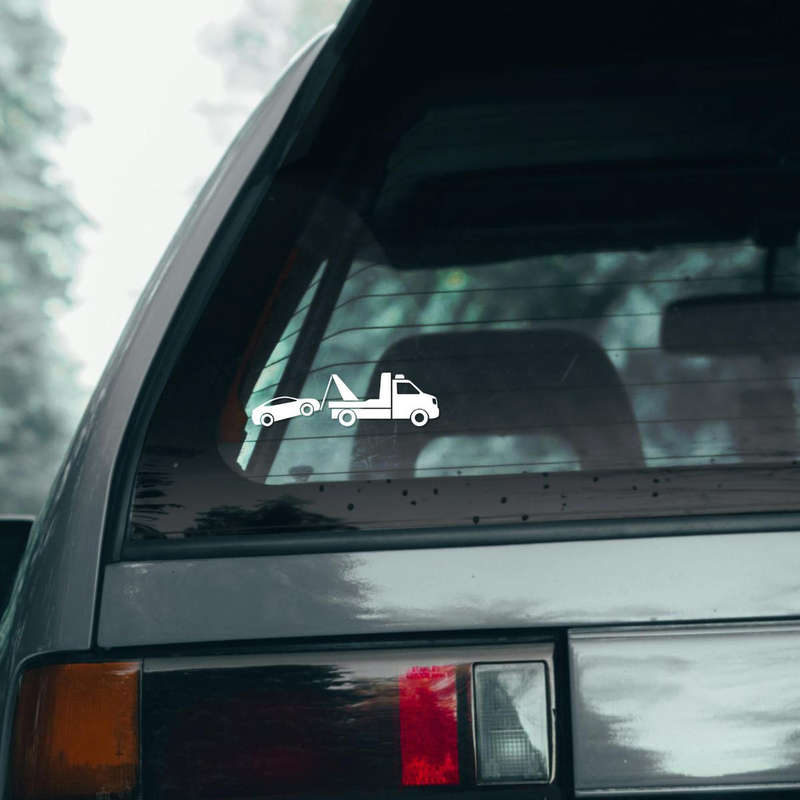
 Salvage & Towing 24 Hour Service Sticker
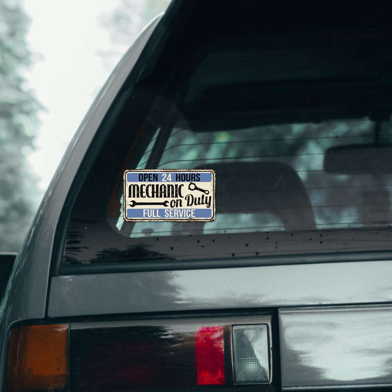
 “Mechanic On Duty” Sticker
 Mechanic On Duty Sticker Vintage Full-Service
 Service Centre Sticker – Bold Mechanic
 Retro Tire Shop Sticker – Vintage “Quality & Safety” Garage
 Tow Truck Vinyl Sticker
 Truck Symbol Decal – Cargo Truck
 Truck Safety Decal – Bold Yellow
 School Bus Sign Sticker
 Trailer Hitch Warning Sticker
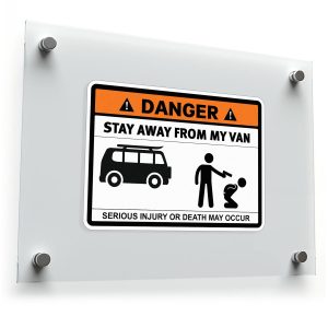 Funny “Stay Away From My Van” Warning Sticker
 Funny Warning: Stay Away from My Caravan Sticker
From our production floor
- Fine lettering is cut on a Summa tangential cutter: the blade is turned at every corner rather than dragged, so small text, sharp serifs and script stay crisp.
- For flat or gently curved panels we use Oracal 651. For rivets, ribs and deep curves we use Oracal 751 cast, which is thinner and does not shrink back.
- Every cut decal is weeded by hand and covered with application tape, so a whole word goes on in one piece with the spacing you designed.
- Apply at around 20 °C on a surface cleaned with isopropyl alcohol, squeegee from the centre outwards, and do not wash the vehicle for 48 hours.
Custom lettering in any font, size and language
Every design in the shop can be changed, and we cut custom lettering from scratch: your company name, phone number or slogan in any text, any size and any language, chosen from a library of about 1,500 typefaces. If you already have a brand font, send it with your logo and we will match it. There is no minimum order: one door set or a whole fleet. Orders ship from Greece with tracking, usually within 1–2 business days.
Not sure which size or film fits your vehicle? Send us a photo of the panel and the measurements, and we will suggest a layout and the right vinyl. For mounting steps, see our guide on how to apply stickers, and for an overview of finishes read types of custom stickers.
FAQ
What is the best font for vehicle lettering?
There is no single best font, but the safest choices are sans-serifs with a large x-height, open apertures and even strokes, such as typefaces in the style of DIN, Frutiger or Transport. Set them in bold or semibold, not in black or thin weights.
How tall should letters be to read from 20 metres?
About 16–17 cm cap height for easy reading, based on the sign industry’s 1 inch per 10 feet rule. Around 6 cm is the bare minimum for a parked vehicle and an attentive reader.
Should vehicle lettering be in capitals?
Use capitals for one or two short words. For names longer than that, mixed case is easier to read at the same height because the word outline is more distinctive.
Can you cut script fonts in vinyl?
Yes. A tangential cutter handles fine script cleanly. The limit is distance, not cutting: thin script lettering is best kept for close-range spots such as doors or the rear window.
Which vinyl should I use for lettering on a van?
Oracal 651 for flat or gently curved panels, and Oracal 751 cast film for ribbed panels, rivets and deep curves. Send us a photo if you are not sure.
More ideas: Vehicle stickers · Profession decals · Mechanic stickers · Typography stickers · Vehicle signs · Funny vehicle signs. Related reading: profession stickers.
